Originally Posted by X-Raited
OK, ....its a wreck that happend long ago,....
But hardly finished tho at this point;


 Banned
OK, ....its a wreck that happend long ago,....
But hardly finished tho at this point;
 Enthusiast
This should be the final version, might do a bit more though not sure.
Last edited by Kooper; 01-25-2007 at 06:32 PM.
 Super Moderator


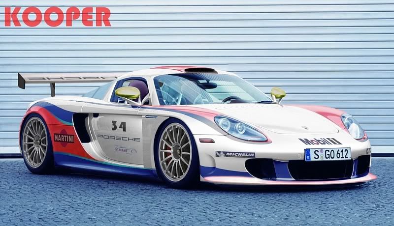
The Mobil1 and Michelin vinyls need some work, and raise the opacity on the Martini ad a bit. The Porsche writing on the wing could be a bit 'bolder' and sharper, and I'd change the style of the number '34', it looks a bit odd.
Besides those little areas above, the chop is sexcellent, I love it.
Rockefella says:
pat's sister is hawt
David Fiset says:
so is mine
David Fiset says:
do want
Enthusiast
Thanks for the feedback Rocke, appreciate it.
Yep, I have to get the vinyls technique up to scratch, at the moment I'm struggling with it a bit. What I particularly find hard is taking a bitmap and curling it if that's the right word. Basically skewing it and curving it, not too sure how to do it with either the Gimp or Photoshop.
I'll try to do some tweaking and get the updated pic up here soon.
Cheers
 Rookie
here's what I have. It might be a final, not sure...
high-res attached as well...
Enthusiast
It looks good Smithy.
Rookie
Beautifull...
 Member

All nice, except MDMs(Though thats not quite finished apparently).
Miscommunication seems to be a direct result of misplaced, text based sarcasm.
Banned
yeah, they all look good ....mine will be ready later tonite I think.
smitty ...tha nice a bit dark and ya prb should take out the reflections from the old BG, I know I'm having to do that too and it's a PITA to do. Like the Race car pic ...I'd add a real number on it tho as said & why is Porsche backwards ???...they ALL look real nice tho IMO.
Last edited by MRDETROITMETAL; 01-26-2007 at 11:31 PM.
Rookie
haha, i'm not really wanting to touch the reflections. They aren't all that noticeable. It's not worth the time for a 45 minute chop.
 Banned
Here's mine...still experimenting with the Gimp
Banned
OK heres mine. Now obviously I went an entirely different direction than the rest of you here (so far), so what else is new ?
So because I redesigned the Entire car, by rebrushing every centimeter of it one way or another, I took extra time to bring back as much of the original sharpness as I could given the time to do this in, and I dont think I can get it much better than this now anyway.
I just hope you all may appreciate the time put into this to bring it up to competitiveness here in the face of your photorealist chops. I included a seperate 800 pix of just the car, if you prefer to use that one for the poll, to me it is more complete with the entire picture, but thats just for my purposes, you may choose to post the single car picture if you want.
THX.

Last edited by MRDETROITMETAL; 01-26-2007 at 11:26 PM.
Enthusiast
Hehe, yeah, the Porsche name is backwards as I took it from another Porsche and had to flip it horizontally. I was kind of hoping no one would notice... oh well.
And your chop, let me be the first to say that I think it looks pretty darn nice! Good work!
 Member
Yeah, its pretty darn cool.
Ditch the lighting effects though.
uʍop ǝpısdn sı ƃuıʇıɹʍ ʎɯ
Enthusiast
Forget the chop, it's just nice that you typed something properly.
Go n-ithe an cat thu, is go n-ithe an diabhal an cat
When you go Home, Tell them for us and say 'For your tommorrow, We Gave Our Today.'
There are currently 1 users browsing this thread. (0 members and 1 guests)
 Posting Permissions

 Reply With Quote